
In this guide
- RGB, RGBW, RGBCCT and addressable: what each actually does
- The 10 percent rule: where colour belongs, and the six places it never does
- Strips, drivers, cable cores and channels
- Colour scene design: saturation, fades and five worked examples
- Festive and facade colour — the case where it is unambiguously worth it
- Eight mistakes that make colour lighting look cheap
- How Pert delivers it (designed, not DIY)
- FAQs
This guide is for homeowners and interior designers specifying lighting for a new or renovated home, and it sits within our wider coverage of home automation in Hyderabad. If you have not yet settled the white lighting underneath — which is the decision that matters more — start with what CCT to use in every room of an Indian home, then come back here to decide which few surfaces should also be able to change colour.
RGB, RGBW, RGBCCT and addressable: what each actually does
These labels are printed on every strip and driver, and the difference between them decides both the look and the cable you have to pull. In plain terms, each letter is a separate LED chip on the strip, and each chip needs its own control channel.
| Type | Chips on the strip | Channels | Cable cores | What it is actually good for |
|---|---|---|---|---|
| Single colour | One fixed CCT | 1 | 2 | Most cove, under-cabinet and wardrobe lighting. Dimmable, cheap, reliable. |
| Tunable white (CCT) | Warm + cool white | 2 | 3 | The correct default for ambient light in living, bedrooms, study. 2700K–6500K, no colour. |
| Dim-to-warm | Warm + extra-warm | 1 | 2 | Warms automatically as it dims, like a halogen. Lovely in dining and bedrooms; no colour and no separate control. |
| RGB | Red, green, blue | 3 | 4 | Colour only. Its "white" is mixed from three chips and reads slightly pink or green — avoid it indoors as anything but a pure accent. |
| RGBW | RGB + one white, usually 3000K | 4 | 5 | The practical choice for an accent that also has to do a decent warm white — niches, TV walls, bars, kids' rooms. |
| RGBCCT (RGBWW, 5-in-1) | RGB + warm white + cool white | 5 | 6 | Full tunable white and colour on one line. The only type that can be a room's main cove and still do festive colour. |
| Addressable / pixel | RGB or RGBW with a chip per segment | 1 data line | 3–4 incl. screened data | Chases, gradients and per-pixel effects. Specialist use only — staircase risers, a games or theatre room. |
Three things in that table catch people out.
RGB white is not white
Mixing red, green and blue to make white gives you a spectrum with deep gaps in it. Skin looks sallow, wood looks flat, and the colour rendering figure that matters on a white light — CRI, and especially R9 for reds — is effectively meaningless on an RGB-only strip. A dedicated white chip at CRI 90 or better is what makes a fixture usable as light rather than as decoration. If you are unsure what those numbers mean on a datasheet, LED light specs explained covers lumens, CRI, R9 and efficacy.
Colour is far dimmer than white
On a typical 24V RGBW strip rated around 14–19 W/m, the white channel supplies most of the lumens. A saturated single colour only lights one of the three colour chips, so a deep blue can land near 10 percent of the strip's white output and a saturated red around 20–25 percent. This is normal physics, not a fault, and it is the single strongest argument for keeping colour off the ambient layer: a cove that reads beautifully at 2700K white will look feeble at full-saturation blue.
Addressable strips are a different reliability class
Pixel strips (WS2812, SK6812 and similar) run a data signal down the tape, so one failed chip can take out everything after it, data runs are usually limited to about four to five metres before a repeater, and the strip is not casually cut and re-joined on site. They also need a screened data core routed away from mains cable. They are wonderful for a staircase chase or a theatre riser and a poor choice for a 14-metre living room cove.
The 10 percent rule: where colour belongs, and the six places it never does
Our planning rule is blunt: colour-capable fixtures should be under about 10 to 15 percent of a home's installed lighting points, and in a sightline you should be able to see at most two hues at once. Colour works when it lights an object or a surface you look at. It fails when it becomes the light you look by.
Where it earns its place, in rough order of value:
- Display niches and shelving. A 600–1200mm niche with a concealed RGBW strip is the best rupee-for-rupee colour in a house. It is small, it is framed, and the colour reads as intentional. Keep the strip in an aluminium profile with a frosted diffuser set back 15–20mm from the niche edge.
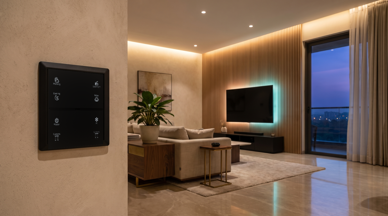
- Television and feature walls. A concealed strip behind a TV or on a fluted-wood feature wall at 40–60mm standoff, driven at 10–20 percent, reduces the contrast between a bright screen and a dark wall and cuts eye strain. This is also the one colour accent that gets used almost daily.
- Bar, counter and under-shelf lines in a lounge or home theatre, where an amber or deep-teal wash on a stone or mirror back-panel does real work at night.
- Staircase and double-height voids. Riser or handrail lighting with a subtle colour scene for festivals, over a plain warm-white default for daily use. Placement, heights and motion triggers are in how to plan staircase and corridor lighting.
- Kids' rooms. The one room where colour is genuinely functional: a colour ceiling cove that a child chooses is worth more in daily use than any other accent in the house. Keep the study light fixed and neutral — see how to plan kids' room lighting and automation.
- Balcony, parapet and facade, covered in its own section below.
Where we specify fixed white and refuse colour, every time:
- Kitchen work surfaces. You judge the colour of food, meat and spices by this light. Fixed 3500–4000K, CRI 90+, no exceptions.
- Bathroom mirror lighting. Colour on the face makes shaving and make-up guesswork. Fixed CCT at CRI 90+.
- The pooja room. Warm, steady and reverent; a colour-cycling pooja niche is the single most regretted accent we are asked to remove. Our values are in how to plan pooja room lighting and automation.
- The dining pendant. Food and skin again. 2700K, dimmable, dim-to-warm if the budget allows.
- Wardrobe and dressing lighting. Clothes must be the colour you think they are.
- The main ambient cove and downlight grid in living rooms and bedrooms. This should be tunable white, so it can follow the day rather than the mood — see how to plan circadian lighting at home.
A useful test before committing: stand in the room and ask whether the surface you are about to make colour-capable is something a guest would look at. A niche, yes. The ceiling perimeter above the sofa, no.
Strips, drivers, cable cores and channels
Colour is a first-fix decision. Almost every retrofit failure we are called to has the same cause: a two-core cable was pulled to a cove that now has to be RGBCCT, and the ceiling has to come down. Specify this before plastering.
- Cable cores, at first fix. Two cores for single colour, three for tunable white, five for RGBW, six for RGBCCT, plus a screened data core for addressable. Pull the highest count you might plausibly want, not the one you have budgeted for today — the cable is the cheapest part of the whole system. This belongs on the electrical points checklist you hand your contractor.
- 24V, not 12V, for anything over about 3 metres. At 12V a long run visibly shifts colour toward red at the far end as the blue and green chips, which need a higher forward voltage, dim first. Beyond about 5 metres per feed, inject power at both ends of the run; beyond about 10 metres, feed from the centre or split into two circuits.
- LED density of 120–240 LEDs per metre for any strip in an open cove or a shallow niche. On lower densities the individual colour chips resolve as visible red, green and blue dots on the diffuser, which looks unmistakably cheap. Pair with a 15–25mm aluminium profile and a frosted diffuser.
- Sensible cut points. RGBCCT strips have long cut intervals — often 100–125mm at 24V — so measure the niche before you specify, or you will be 90mm short at a corner with nothing to do about it.
- Driver and channel headroom. Every colour chip is a channel: one 8-metre RGBCCT cove consumes five controller outputs, the same as five separate single-colour circuits. Count these into your control schedule early, alongside load per channel and the minimum load the driver needs — the method is in how to plan dimmer channels and lighting loads.
- Constant-voltage drivers with real low-end performance. Colour scenes live at 10–30 percent, exactly where poor drivers step, buzz or drop a channel entirely, producing the classic symptom of a "purple" scene turning pink as it dims. Insist on smooth dimming to 1 percent and see why LED lights flicker or buzz when dimmed.
- Driver location and heat. Drivers go in an accessible, ventilated position — a serviceable ceiling hatch or the control enclosure — never sealed above a gypsum ceiling. Colour drivers fail more often than single-colour ones simply because they have more to go wrong.
- One family of strip and driver per home. Mixing two vendors' RGBW tape means the same "amber" scene renders as two different ambers in two rooms, because the chip binning and white points differ. Pert's smart COB, strip and spot lighting is specified as a single matched family for exactly this reason.
Colour scene design: saturation, fades and five worked examples
Colour scenes fail on values, not on hardware. Four rules cover most of it:
- Cap saturation at 60–80 percent, not 100. A fully saturated blue or green is the difference between a hotel lobby and a car showroom, and it is what makes skin look unwell.
- Run the white channel underneath. On RGBW and RGBCCT, hold the white chip at 10–20 percent beneath a colour accent. The colour reads richer and the surface keeps some texture instead of going flat.
- Fade colour over 3–10 seconds on a scene press, and over 60–120 seconds if a scene drifts between hues on its own. Anything faster reads as a light show.
- Never put a colour picker on the daily path. An app colour wheel is used twice in the first week and never again. What gets used is an engraved scene button on a wall keypad — so scenes get names like Festive, Party or Movie, never "Colour".
Five scenes worth commissioning, with the values we start from:
| Scene | Ambient (tunable white) | Colour accents | Fade | Notes |
|---|---|---|---|---|
| Movie | Cove 10–15% at 2400K, downlights off | TV backlight only, 12% at a low-saturation warm amber | 3 s | Niche and bar off; curtains closed. The one colour accent that runs almost every night. |
| Evening / Guests | Cove 45% at 2700K, downlights 20% | Niche 35% at 70% saturation amber or deep gold, white underneath at 15% | 4 s | One hue only, matched to the metal and wood in the room. |
| Party | Cove 30% at 2700K — keep it warm and low, not off | Niche and bar drift between two hues of one family (e.g. magenta to deep violet) over 90 s | 6 s in | Two hues maximum, no strobing, no rainbow cycling. |
| Festive | Cove 50% at 2400K, foyer 60% | Niche, staircase and facade at 2200K amber-gold, saturation 50% | 8 s | Runs on an astronomical timer from sunset to 11pm for the festival week. |
| Kids' Night | Room lights off | Ceiling cove 8% at a low-saturation colour the child picks, plus a 2200K floor-level path at 3% | 10 s | Hard timeout to the night path at a set hour so it is not left on all night. |
Note what the ambient column is doing in every row: it stays warm white and stays on. Colour scenes read as designed precisely because the warm-white layer is still carrying the room. If you want the full method for writing scene values, triggers and fades, how to design home automation scenes with worked examples works through eight of them in detail.
Festive and facade colour — the case where it is unambiguously worth it
If there is one place colour pays for itself in an Indian home, it is outside. A facade, parapet, balcony soffit or compound wall that can shift from a daily warm 2700K wash to festival gold for Diwali, and to whatever a family wants for a wedding or a birthday, replaces the annual ritual of stapling temporary string lights to a balcony railing. Planning notes:
- IP65 as a minimum on any covered balcony or soffit line, IP67 for anything exposed to direct monsoon rain, in a planter, or at parapet level. Use a sealed profile with end-caps and gland the joints properly — the failure point is almost always the joint, not the tape.
- Keep drivers inside. Run low-voltage cable out to the fixture and leave the driver in a dry, ventilated, serviceable position indoors or in a utility shaft.
- Grazing distances matter more than colour. A facade strip set 100–150mm off the wall face grazes texture beautifully; at 300mm it just floods and the stone goes flat. Beam angles, setbacks and the astro timing are covered in how to plan balcony, facade and outdoor lighting.
- Put it on an astronomical schedule, on at sunset, off at a fixed hour like 11pm, and give the festive variant a defined end date so it does not run into January. Keep the facade circuit separate from the security lighting and cameras, which have their own always-on logic — see our home security range and how to plan CCTV camera and sensor placement at home.
- Consider your neighbours and your own bedrooms. A saturated colour wash on a parapet reflects into upstairs rooms and across to the flat opposite. Aim down or across, never up into windows, and pair it with motorised curtains that close before the facade scene starts.
Eight mistakes that make colour lighting look cheap
- Colour on the main cove. The ambient layer should be tunable white. Colour belongs on objects.
- Full saturation. 100 percent blue or green is the fastest way to make a premium interior look like a showroom floor.
- More than two hues in one sightline. A magenta niche facing a teal TV wall reads as an accident.
- Rainbow cycling. Continuous hue rotation is a demo mode, not a design. If a scene drifts, keep it inside one colour family and give it a 60–120 second cycle.
- Low LED density in an open cove. Visible red, green and blue dots on the diffuser undo an otherwise good scheme.
- Two-core cable to a cove that later needs five. The single most expensive mistake on this list, because the fix is opening the ceiling.
- Relying on an app colour wheel. If a colour needs a phone, it will not be used. Commission it as a named, engraved scene — the reasoning is in do you need a smart home app, wall keypad, or both.
- Buying colour instead of buying dimming quality. A home with flawless flicker-free warm-white dimming and one good colour niche will always feel better than a home with colour everywhere and a cove that steps and buzzes at 15 percent.
How Pert delivers it — a designed solution, not a DIY kit
Pert is a solutions company: we design and install. We do not drop a box of colour tape and a phone app on a family and call it automation. On a colour-capable project that means we mark on the reflected ceiling plan exactly which runs are single colour, tunable white, RGBW or RGBCCT; we write the cable core count for each run into the electrical drawing before first fix so nothing has to be opened later; we size drivers and controller channels with headroom for the extra colour channels; we select one matched strip, profile and driver family so an amber in the foyer matches the amber in the lounge; we set saturation, white-underneath and fade values on site with the furniture in place rather than off a datasheet; and we engrave the keypad with the scenes a family will actually press. Then we come back after a few weeks and tune the values, because colour is the one part of a lighting scheme that always reads differently once people are living in the room.
If you are still choosing who should design and install this, best home automation companies in Hyderabad sets out what to check, including whether a company will tell you where not to put colour.
Planning a new home in Hyderabad and not sure which surfaces should be colour-capable? We will mark the runs on your ceiling plan, specify the cable before first fix, and commission colour scenes your family will still be using next Diwali. Request a consultation →
Frequently asked questions
What is the difference between RGB, RGBW and tunable white lighting?
RGB mixes red, green and blue only, so it does colour well and white badly. RGBW adds a dedicated white chip, usually 3000K, so one strip can do a proper warm white plus colour. RGBCCT (five-in-one) adds both warm and cool white chips, giving real tunable white from about 2700K to 6500K alongside colour. Tunable white has no colour chips at all and only shifts between warm and cool — which is what the ambient lighting in almost every room should be.
Is RGB colour lighting worth it in a home?
In small, deliberate doses, yes — on a display niche, a TV feature wall, a bar line, a staircase, a kids' room and the facade. It is not worth it on the ambient layer. We keep colour-capable fixtures under about 10 to 15 percent of a home's lighting points, because colour output is a fraction of white output and saturated light on skin, food and wood looks wrong.
Do colour-changing lights need special wiring?
Yes, and it must be decided before the false ceiling closes. Single colour needs two cores, tunable white three, RGBW five and RGBCCT six, all running back to the controller rather than to a switch. Runs over about five metres at 24V need power injection at both ends, and addressable strips need a screened data core. Retrofitting a two-core cove to RGBCCT means opening the ceiling.
Why do my colour-changing lights look dim compared to white?
Because they are. The white channel supplies most of the lumens on an RGBW strip, so a saturated deep blue can land near 10 percent of the strip's white brightness and a red around 20 to 25 percent. Keep saturation at 60 to 80 percent rather than maximum and hold the white channel at 10 to 20 percent underneath the colour, so the accent reads rich rather than dim — and never ask colour to light the room.