
In this guide
- What colour temperature actually is
- The brightness myth — and the Kelvin/lumen confusion
- The room-by-room CCT chart
- Four rules for mixing colour temperatures
- CCT is one of four numbers on the spec sheet
- Tunable white: when you stop choosing
- Turning CCT into scenes people actually use
- How Pert delivers it (designed, not DIY)
- FAQs
Colour temperature is the decision homeowners are least prepared for and most affected by. Budget, brand, and fixture type get discussed for weeks; CCT gets decided in thirty seconds at a counter, usually by someone asking "warm or white?" and the customer guessing. By the time the home is lit, the choice is fixed in the ceiling. This article is part of our wider coverage of home automation in Hyderabad, and it deals with getting that number right before it is baked in.
What colour temperature actually is
Correlated Colour Temperature — CCT — describes the colour of white light on a scale measured in Kelvin (K). Counter-intuitively, lower numbers are warmer and higher numbers are cooler, because the scale comes from the colour a black body radiates as it is heated. The practical range in a home is narrow:
- 2200K — deep amber, close to candlelight or a filament bulb at low output. A mood value, not a working one.
- 2700K — classic warm white. The colour of a traditional incandescent bulb, and the default for living rooms, bedrooms and dining in most well-lit homes.
- 3000K — warm white with a little more clarity. Slightly crisper than 2700K without going clinical; a safe general-purpose value.
- 3500K — neutral. Reads as neither warm nor cold. Useful in bathrooms and as a bridge value.
- 4000K — cool white / neutral daylight. Alert, accurate, unforgiving. Belongs on task surfaces.
- 5000K–6500K — daylight. Appropriate in a garage, a workshop, or a hospital. In a residential living room it is the single fastest way to make a home feel institutional.
One more piece of physics worth knowing, because it explains most bad lighting: warm light and dim light go together, cool light and bright light go together. Light a room at low levels in 4000K and it reads as gloomy and slightly grim; light the same room at low levels in 2700K and it reads as intimate. This relationship between light level and colour comfort is why a dimmed cool-white living room never feels right no matter how far you turn it down — and why the fix is a warmer CCT, not more dimming.
The brightness myth — and the Kelvin/lumen confusion
The most common misunderstanding we meet on site is the belief that cool white is brighter. It is not. Brightness is lumens; colour is Kelvin; they are independent numbers on the same box. A 1,000-lumen fixture at 2700K and a 1,000-lumen fixture at 4000K deliver exactly the same quantity of light. Cool white only feels brighter because higher blue content raises alertness and makes edges look sharper.
This matters commercially, because a homeowner who finds a room dim and responds by switching everything to 4000K has solved the wrong problem. The room is under-lit — it needs more lumens, better fixture placement, or a second layer of light. Changing the colour makes it feel busier without making it more usable, and costs the home its warmth in exchange. If you are still deciding which fixtures go where, our guide to panel vs COB vs strip vs spot lights covers where each type belongs.
The room-by-room CCT chart
Here is the specification we work from on most Hyderabad projects. Treat it as a strong default, adjusted for how dark your finishes are — deep walnut veneer and dark stone absorb a great deal of light and often need a little more output, though not a cooler colour.
Living room — 2700K to 3000K
The room where warmth matters most. Cove and ambient light at 2700K, accent spots on artwork and texture at 3000K so highlighted objects read slightly crisper than their surroundings. Nothing in a living room needs 4000K. If yours currently has it, that single change will transform the room more than any furniture will.
Dining — 2700K, tightly controlled
A dining table is about food and faces, both of which need warmth and excellent colour rendering. A pendant at 2700K with a narrow-ish beam over the table, dimmable to roughly 30% for dinner, with the surrounding room a step lower so the table becomes the bright point in the space.
Kitchen — 3000K ambient, 4000K on the counter
The one room where a deliberate two-CCT split is correct. Ambient ceiling light at 3000K keeps the kitchen continuous with the living space it usually opens onto; under-cabinet task light at 4000K lets you judge whether chicken is cooked and whether coriander is fresh. The full working numbers are in how to plan kitchen lighting & automation.
Bedroom — 2700K, with one exception
Everything you see from the bed should be 2700K: cove, downlights, bedside reading lights. The exception is the wardrobe interior, where 4000K makes it genuinely possible to tell navy from black at 7am. Because the wardrobe light is hidden behind a shutter, it breaks no sightline rule.
Bathroom — 3000K ambient, 3500K to 4000K at the mirror
The mirror is the only place in a home where the light needs to arrive vertically at your face rather than from overhead. Vertical light at 3500K–4000K on both sides of the mirror at roughly face height eliminates the under-eye shadows a ceiling downlight creates, and gives accurate colour for shaving and make-up. Keep the general bathroom lighting at 3000K so a 2am visit is not a shock.
Study or home office — 4000K on the desk, 3500K around it
The one living space where cooler is right, because sustained focus benefits from it. Keep the desk task light at 4000K and the room's ambient at 3500K; going straight from a bright cool desk to a dark warm room is what causes eye fatigue over a long working day.
Corridors, staircases and foyer — 3000K
Circulation spaces are seen in passing and are usually visible from adjoining rooms, so they should match the warmer side of the house. Their more important variable is level, not colour: a corridor at 100% is wasteful and at 10% overnight is perfect.
Pooja room — 2700K or warmer
Warm light flatters brass, gold, silk and marigold; cool light makes all four look grey. 2700K with high colour rendering, dimmable, is the right answer here almost without exception.
Utility, store and service areas — 4000K
Nobody relaxes in a utility. Cool, bright and even is exactly right for sorting laundry and finding things in a storeroom.
Balcony, deck and façade — 2700K
Warm outdoor light looks better against plants and stone, spills less unpleasantly into neighbours' windows, and attracts noticeably fewer insects than blue-heavy cool white — a real consideration during a Hyderabad monsoon.
Four rules for mixing colour temperatures
Mixing CCT is not the mistake. Mixing it arbitrarily is. Four rules keep a multi-CCT home coherent:
- One CCT per continuous ceiling plane. If a run of downlights sits in a single unbroken ceiling, every one of them is the same value. Nothing looks more accidental than one warm downlight in a row of cool ones.
- No more than two colour temperatures in a single sightline. Stand at the entrance of your living-dining-kitchen and look across. If you can see three different whites at once, one of them is wrong. Two is a designed contrast; three is a mistake.
- Step cooler only where there is a real task. A counter, a mirror, a desk, a wardrobe interior. If you cannot name the task, keep it warm.
- Specify colour consistency, not just colour. Two fixtures both labelled 3000K can visibly differ. Ask for a tolerance of 3 SDCM or tighter (also written as a 3-step MacAdam ellipse) across a project, and for a single production batch on any continuous run. This is the detail that separates a specified job from a bought-off-the-shelf one — and it is the same discipline we describe for strip runs in how to plan cove lighting in a false ceiling.
CCT is one of four numbers on the spec sheet
Colour temperature alone does not make light good. Four numbers together do, and homeowners are usually shown only one of them:
- Lumens (lm) — how much light. Roughly 700–1,200 lm per metre for an ambient cove; 300–500 lm per running metre of kitchen counter for task work.
- CCT (K) — what colour that light is. The subject of this guide.
- CRI / R9 — how faithfully colours appear under it. Insist on CRI 90+, and specifically ask about R9 (deep red) above 50. Low R9 is why wood looks grey, skin looks tired, and tomatoes look dull under otherwise adequate light.
- Flicker and dimming range — whether the light stays comfortable when dimmed. A driver that flickers below 20%, or clips off entirely at 15%, makes every warm evening scene you planned unusable. Ask for the minimum stable dim level in writing.
A 4000K fixture with CRI 95 will flatter a room more than a 2700K fixture with CRI 75. Colour temperature sets the mood; colour rendering decides whether everything in the room looks like itself.
Tunable white: when you stop choosing
Everything above assumes a fixed-CCT fixture, where the colour is decided at manufacture and never changes. Tunable white fixtures shift across a range — typically 2700K to 6500K — on command, which converts the room-by-room decision from permanent to scheduled.
That is genuinely useful in the rooms you occupy across a whole day. A living room that runs 4000K at 8am reads awake and matches the daylight coming through the window; the same room at 2700K after sunset reads settled. A study that is 4000K through the working day and 3000K at night lets the same desk serve two purposes. A bedroom that drops to 2200K after 10pm gives you enough light to move around without the blue content that makes it harder to fall asleep afterwards.
It is worth being honest about where tunable is not worth the premium: utility areas, storerooms, wardrobes and service spaces have one job and should stay fixed. We specify tunable and dimmable smart lighting for the primary living spaces and fixed CCT elsewhere, which keeps the budget where it changes the experience. The wider case for it is in tunable and dimmable lights: why they are becoming the new standard.
Turning CCT into scenes people actually use
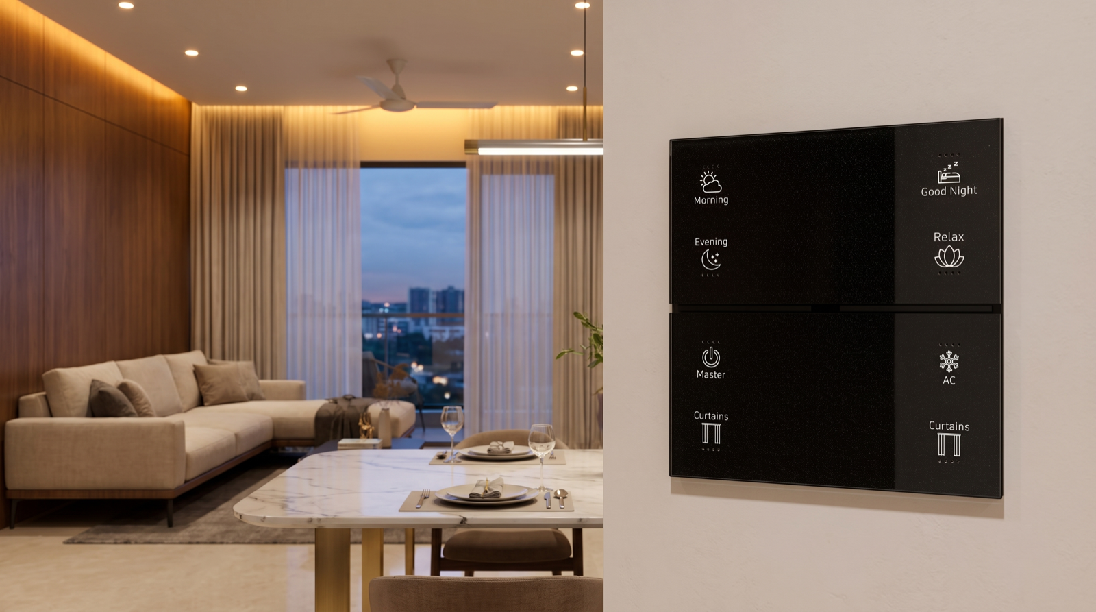
Tunable lighting only pays off if nobody has to think in Kelvin. No family member is going to open an app and drag a slider to 3,200 at dinner. The colour shift has to be built into scenes and put on a wall keypad. A typical living-room configuration looks like this:
- Morning — cove at 60% and 4000K, downlights at 50%, curtains open. Cool and bright to match the daylight arriving.
- Day — cove at 40% and 3500K, relying mostly on daylight, sheers closed against west sun.
- Evening — cove at 45% and 2700K, accent spots at 70%, blackout curtains closed. The room turns warm at the same moment the sky does.
- Dinner — dining pendant at 35% and 2700K, living-room cove at 20%, everything else off.
- Movie — cove at 10% and 2200K, all else off.
- Good Night — lighting off, curtains closed, security armed.
Those six presses replace perhaps forty individual adjustments, which is the entire argument for scene-based automation over app-only smart devices. They run from a wall keypad at the room entrance so guests and grandparents use the system as easily as you do, and the same scenes pull in motorised curtains and home security so one press sets the room rather than one circuit. For the fuller room-by-room approach, see how to plan smart lighting for a new home.
How Pert delivers it — a designed solution, not a DIY kit
Pert is a solutions company: we design and install, we do not hand over a box of parts. On colour temperature specifically that means a site visit to see your actual finishes — because the same 3000K light behaves very differently against white marble and against dark veneer — followed by a lighting layout that carries the CCT, lumen output, CRI and dimming specification for every fixture on the same drawing your electrician and false-ceiling contractor work from. We coordinate that with your interior designer before the ceiling closes, install and commission the system ourselves, and then tune the scenes in the finished room after dark, because a colour temperature that looks correct on a specification sheet rarely looks correct at 9pm.
If you are adding lighting during a renovation rather than new construction, read can you add home automation during renovation in Hyderabad. And if you are still comparing providers, our guide to the best home automation companies in Hyderabad covers what to check before you sign.
Choosing lights for a home in Hyderabad? Get the colour temperature, output and dimming specified room by room before anything is ordered — it is free to change on a drawing and expensive to change once it is in the ceiling. Request a consultation →
Frequently asked questions
Is 3000K or 4000K better for a home?
For rooms you relax in — living, bedroom, dining — 3000K or warmer is almost always better, because warm light at low levels is what reads as comfortable. Keep 4000K for work surfaces: the kitchen counter, a study desk, the bathroom mirror, the utility area, wardrobe interiors. Using 4000K everywhere is the most common lighting mistake in Indian homes.
Does cool white light give more brightness than warm white?
No. Brightness is lumens, colour is Kelvin, and they are independent. A 1,000-lumen light at 2700K and one at 4000K emit the same amount of light. Cool white only feels brighter because blue content raises alertness. If a room is dim, add lumens — do not change the colour.
Can I mix different colour temperatures in the same house?
Yes, by room and by function rather than randomly. Keep one CCT across a continuous ceiling plane, no more than two colour temperatures in a single sightline, and step cooler only where there is a genuine task. Also specify a tolerance of 3 SDCM or tighter so two fixtures labelled the same value actually match.
What is tunable white lighting and is it worth it?
Tunable white fixtures shift colour temperature on demand, usually across 2700K to 6500K, so one fixture serves both a bright morning and a warm evening. It is worth the premium in rooms you use all day — living room, bedroom, study — and unnecessary in utilities and storerooms. Pert builds the day-to-evening shift into keypad scenes so nobody has to think about Kelvin values.